NOAA GLANSIS Site Redesign
Improving usability to help biologists in the field and students in the classroom
The Client
The National Oceanic and Atmospheric Administration's Great Lakes Aquatic Nonindigenous Species Information System (NOAA GLANSIS)
The Duration
Four months (one semester)
The Context
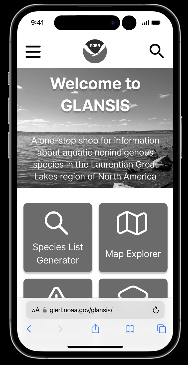
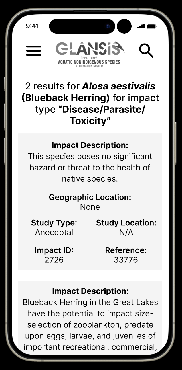
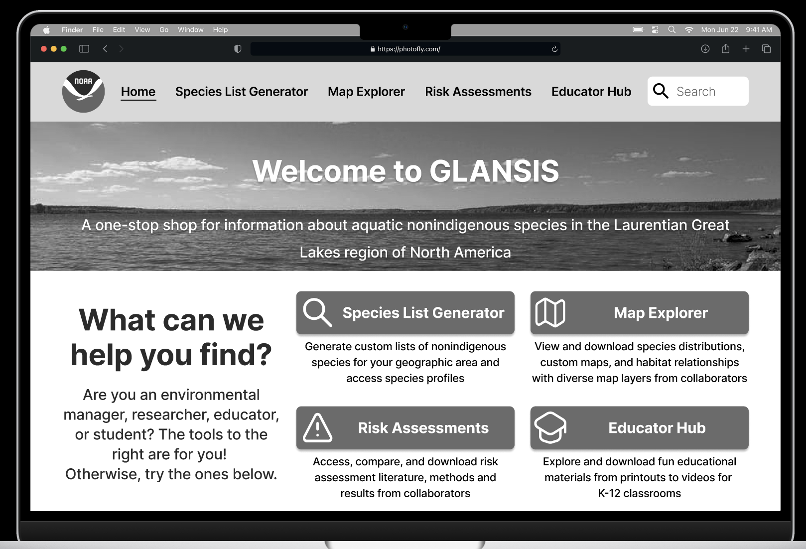
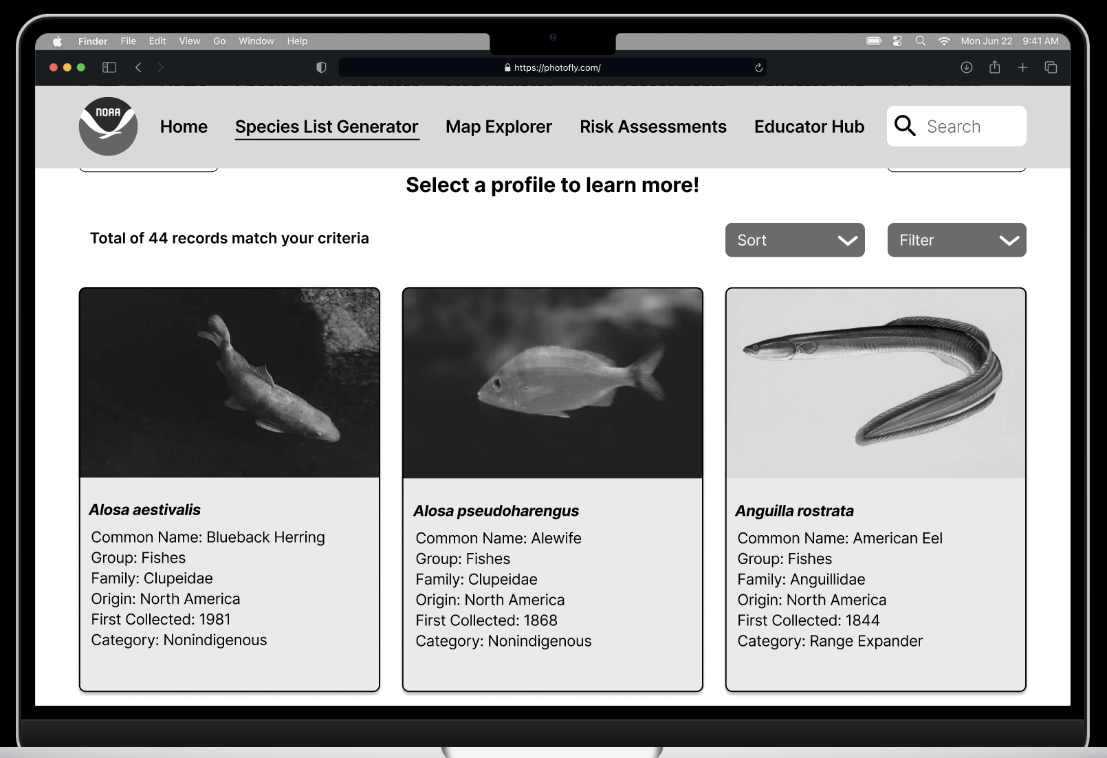
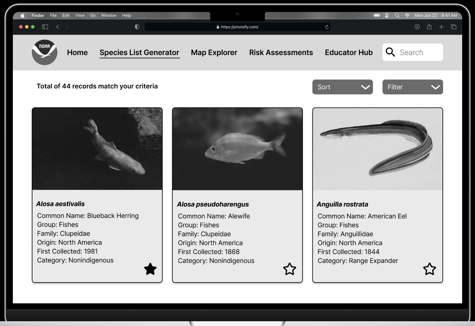
The website for NOAA’s GLANSIS is the home for all things invasive species in the Great Lakes region and has diverse audiences. The most urgent redesign for the client was the Species List Generator, which takes in various user inputs and produces a list of species that meet the criteria. From this list, users can gather more information by accessing Species Profile Pages. Unfortunately, this tool is cluttered, with unclear navigation and intimidating walls of text.
The Problem
There are over sixty invasive species in the Great Lakes, which cause immense damage to the ecosystems, organisms, and economies of the area. The GLANSIS website is a hub for managers and researchers to access information about these species so that they can make effective decisions about limiting populations in their regions and learn about their relationships and impacts. The current design of the Species List Generator makes this difficult, as the search options are often unclear and the Species Profile Pages are nearly unreadable. It is difficult to browse results in the current table format and it is difficult for users to know what to click on. Additionally, the generator is not designed for mobile, resulting in a clunky and unprofessional experience.
The Process
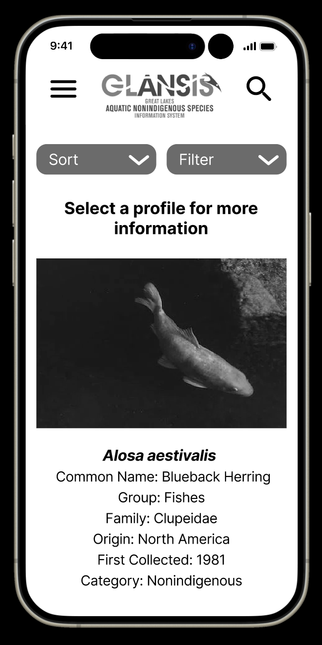
Early iterations focused on making the site accessible and usable from mobile devices. This included a clear hierarchy of information on the homepage and clickable tiles for species and impacts, rather than the old table format. This increased readability and made it easier for users to find what they were looking for. But, they could be better.
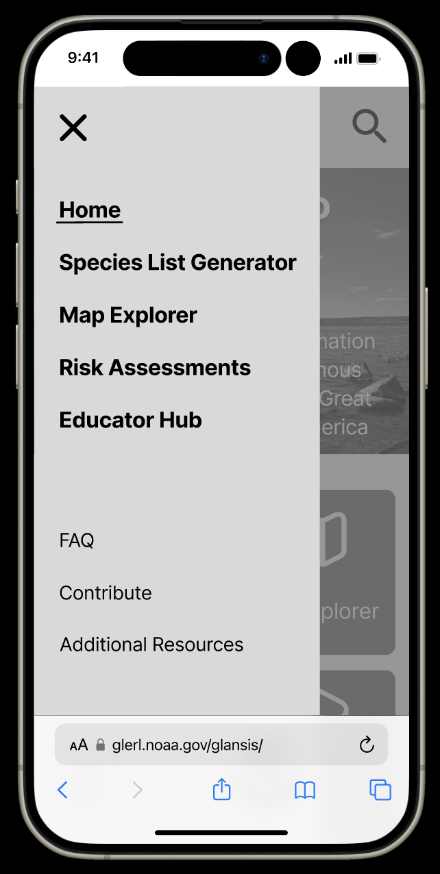
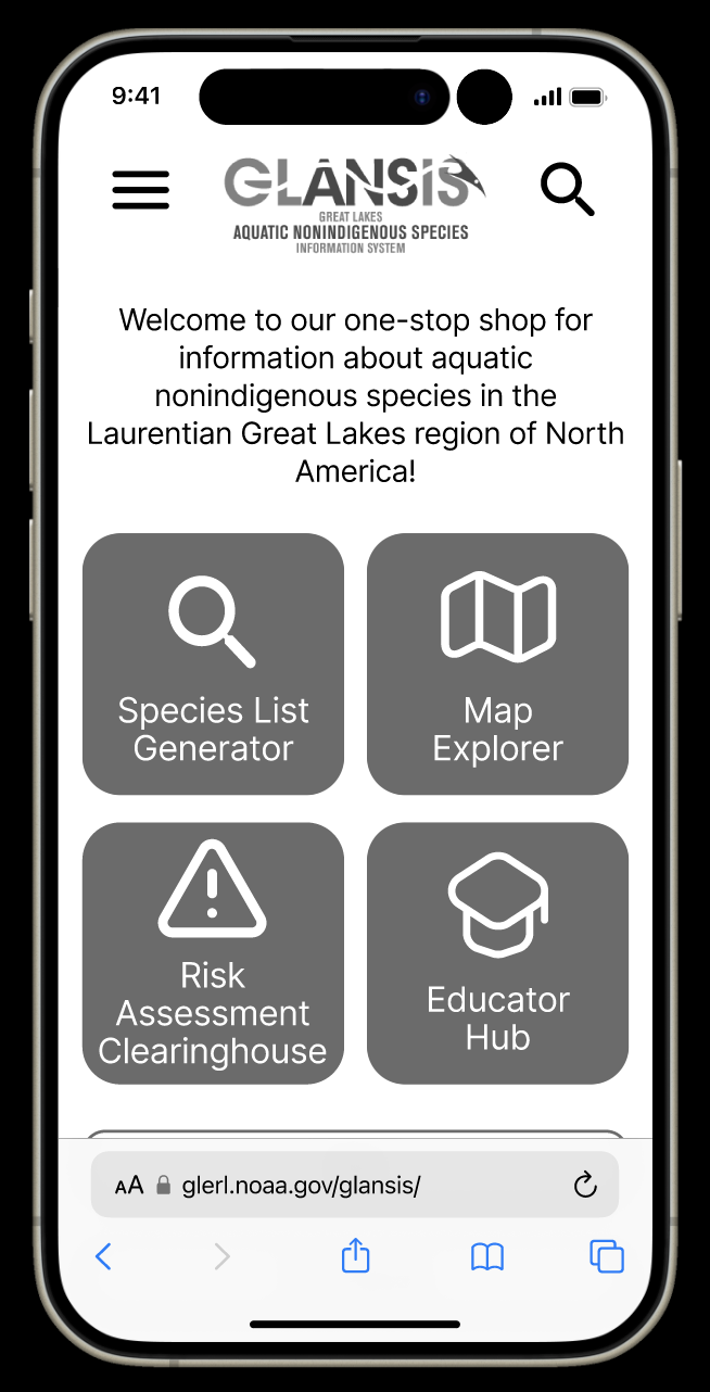
User testing revealed that the new hierarchies and flows were intuitive to inexperienced users, so the next iteration focused on adding more functionality like the hamburger menu view, and making clickable areas more obvious, such as adding a border and colored background to the species cards.
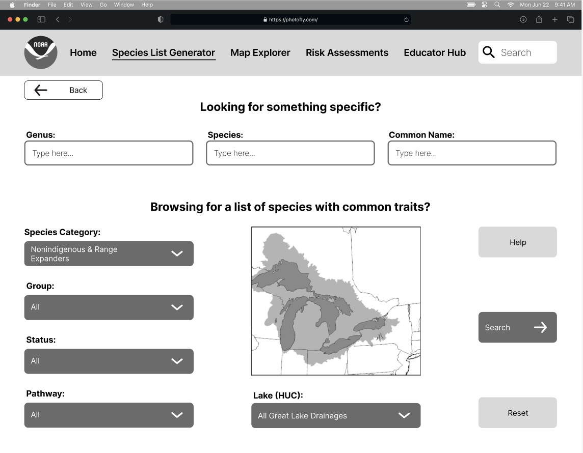
The next step was expanding these base mobile designs to a desktop breakpoint. Many of the screens transferred easily, simply by increasing the size of the buttons, tiles, and text. With the larger screen size, more detailed information could fit on the homepage.
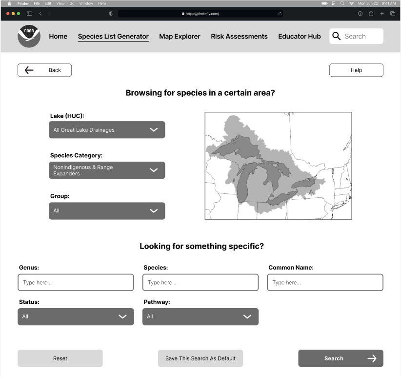
Finally was one last stage of iteration based on instructor and classmate feedback as well as input from possible users. The main changes in this step were the desktop search page layout (from the left image to the center and the addition of a favoriting feature (the right), allowing users to save records and searches for their next visit.
Takeaways
I learned so much through this process, from technical skills like prototyping in Figma to evaluation techniques like heuristic evaluation. This was my first formal design experience, so I was able to finally bring together all of my theoretical knowledge into an actual, in-the-world design. Working with a client was also incredibly beneficial, as I learned to incorporate their goals and limitations, as I would in the workforce.